In case you didn't notice, directly above the posts we have a new section called "Bsquared86 Overload." What is it? It's my twitter updates! Want to catch up to the minute MFA updates? Loc Updates? Mid-day rants? Music raves? Random Babble? Take a peek at the Bsquared86 Overload or, better yet, follow me on Twitter!
I joined Twitter at the urging of one of my friends and now I'm hooked. It's like bite-size blogging, lol. I don't always have time to blog but twitter is literally at my fingertips 24/7 (thanks to my handy dandy I-phone).
I started to just get a personal twitter account for fam and friends but I decided to make it open, using my blog screenname, because I want to hear from YOU!
Yes, you!
you, at your work desk, sneaking on to blogspot . . .
and you, in the campus computer lab lollygagging when you should be writing a paper . . .
and you, newly natural/loc'd beauty or makeup newbie searching for tips . . .
and you, aspiring MFA student that checks your email every 5 minutes and answers every strange phone number with a bright and cheery voice . . .
I want to here from all of you!
I want to talk to you . . . hear how your day is going . . . answer your questions . . . laugh at your fave youtube video . . . and stay up to date with your various projects and journeys. So come on over to Twitter and make yourself comfortable. If you're already on there, send me a message!
I loved my old pink-zebra background and smiling title banner/thingy but it was time for it to go! The pink wasn't rocking my socks anymore and the narrow page layout made pic croppin/resizing a pain. I was also tired of looking at myself with my TWA (read:teeny-weeny afro) when I've been loc'ing for 6 months now (WOOT!). So, yeah . . . I needed a change.
First, I was in love with a turquoise background but it didn't feel crisp enough (if that makes sense) and then I settled for a white background . . . but the white was a bit too bland. So, I decided to go back to black. It's easier on the eyes (and wattage, according to Blackle) and makes me feel all sleek and chic (ok . . . that was corny . . . I'm sorry, lol).
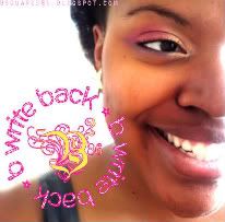
As usual . . . the banner was created by ME and I hope that you will respectfully leave it where it is (swiper, no swiping!).
Stay tuned for a few other structural changes . . . I'm currently at work on the sidebar . . . it feels both cluttered and empty to me, lol.
How do you like the new look? Hate it? Love it? Miss the old? Good riddance? Any suggestions? Helpful HTML tips? Leave me a comment or tweet me on twitter!
I really like your banner! And the whole look is a great improvement. I don't do twitter yet since cell phone signal is poor here.
ReplyDelete